Search results for: “dark mode “

  • New Update for App Store Connect: Dark mode icon and bug fixes

    New Update for App Store Connect: Dark mode icon and bug fixes

    The App Store Connect app, which helps developers manage their software on the App Store, has been updated to version 2.1. This update brings a new look with a dark mode icon, switching from the usual white background to a sleek black one.

    Here are the fixes included in this update:

    • Fixed a problem where reviews for apps only available on macOS were not showing up in the Ratings and Reviews section.
    • Corrected an issue that prevented some apps from sharing their marketing videos.
    • Fixed a glitch in the Trends section so Finance and Sales users can now see all the necessary details.
    • Other small tweaks have been made to make the app run more smoothly.

    Apple has recently added the option for dark mode icons with iOS 18. To change how your icons look, simply hold down on your Home screen, hit ‘Edit’ at the top left, then ‘Customize’, and you can choose from light, dark, automatic, or even tint the icons to your liking.

  • A tiny issue with switching app icons to circles in iOS 19 and iOS 18.4’s cool new notification trick stands out

    A tiny issue with switching app icons to circles in iOS 19 and iOS 18.4’s cool new notification trick stands out

    There’s a small hiccup if Apple decides to change app icons from squircles (rounded squares) to circles in iOS 19. Squircles work well because they fit nicely with different app designs—like Safari’s big circle or Notes’ full-space look.

    But circles? They might not be as practical. For apps with square designs, like Reddit or Slack, shrinking them into a circle could make them harder to see quickly. This isn’t a huge deal, but it could feel less efficient.

    Plus, many apps use the squircle shape to mimic real objects (think Contacts or Apple Sports). Circles might mess that up. Sure, developers could tweak their icons, but after recent updates for dark mode in iOS 18, asking them to redo everything again seems like a stretch. Squircles just seem to balance style and function better—do you agree?

    One of the best surprises in iOS 18.4 is a smart notification feature powered by Apple Intelligence. Called Priority Notifications, it makes your lock screen way more helpful. It figures out which alerts matter most and puts them right at the top.

    You can still swipe to see everything else, but this saves time. Best part? You can turn it on or off for specific apps, so you’re in control. With too many notifications buzzing daily, this simple tool helps you focus on what’s important. It’s a small change, but it feels like a big win. Are you excited to try it?

  • Bridging the Gap: Customization and connectivity in the Apple Ecosystem

    Bridging the Gap: Customization and connectivity in the Apple Ecosystem

    The lines between Apple’s operating systems, iOS and macOS, have blurred significantly in recent years. Features often debut on iPhones and iPads before making their way to Macs, creating a more cohesive user experience. Yet, some key areas of divergence remain, particularly in customization, and whispers of Apple revisiting the networking space suggest exciting possibilities for the future.

    One of the most noticeable differences lies in the level of personalization offered across devices. While iPhones and iPads have embraced extensive customization options, Macs have lagged behind. Let’s delve into some specific areas where macOS could benefit from adopting features already present in iOS and iPadOS.

    The Lock Screen: A Canvas for Expression

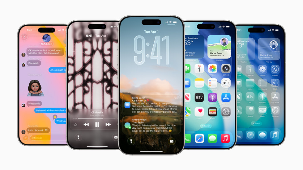
    With the introduction of iOS 16 and iPadOS 17, Apple transformed the lock screen from a static display into a dynamic hub. Users gained the ability to add widgets, personalize fonts, and create multiple lock screens tailored to different contexts. This level of personalization brought a fresh, vibrant feel to the mobile experience. 

    In contrast, while a step forward, macOS Sonoma’s lock screen redesign felt comparatively restrained. It lacked the interactive elements and granular control offered on iOS and iPadOS. The absence of widgets and font customization left many Mac users yearning for a similar level of expressive freedom. Imagine a Mac lock screen that could display calendar appointments, weather updates, or even control smart home devices at a glance. This seamless integration of information and functionality would significantly enhance the Mac’s user experience.

    App Icons: A Matter of Preference

    App icon customization is another area where iOS and iPadOS have taken the lead. While developers have long had the option to offer alternative icons within their apps on mobile, iOS and iPadOS 18 introduced system-wide options for dark mode and tinting, allowing for more cohesive home screen aesthetics. This subtle but impactful feature allows users to further personalize their devices and create a visual experience that resonates with their individual tastes. 

    While macOS allows for basic app icon changes, it’s not as prevalent or seamless as on mobile. Expanding these options on macOS could offer users a greater sense of ownership over their digital environment. Imagine being able to match your app icons to your desktop wallpaper or create themed workspaces based on color palettes. This level of personalization, while seemingly minor, can significantly enhance user satisfaction and engagement.

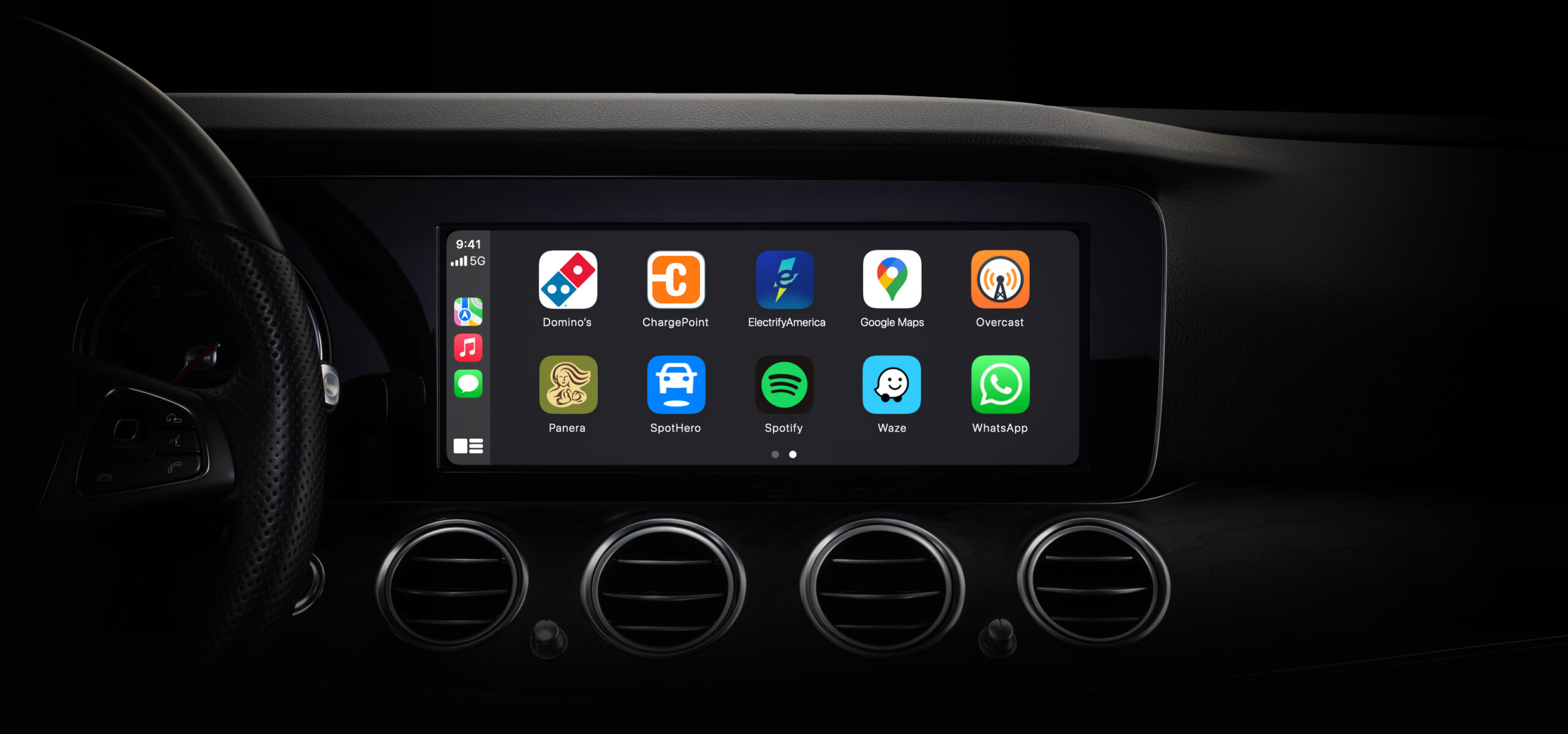
    Control Center: Centralized Control, Personalized Access

    The Control Center, a central hub for quick settings and controls, has also seen significant improvements on iOS and iPadOS. Recent updates have enabled third-party app integration, allowing developers to create custom toggles for their services. This empowers users to tailor their Control Center to their specific needs, providing quick access to frequently used functions. 

    macOS’s Control Center, while functional, has remained largely unchanged since its introduction. Implementing third-party integration, similar to iOS and iPadOS, would greatly enhance its utility. Imagine controlling smart lights, music playback from various apps, or even VPN connections directly from the Control Center. This level of integration would streamline workflows and provide a more unified experience across the Apple ecosystem.

    Beyond Software: Whispers of Apple’s Networking Ambitions

    Beyond software features, rumors have surfaced regarding Apple’s potential return to the networking hardware market. While a direct successor to the AirPort routers isn’t currently in development, Apple is reportedly exploring alternative approaches.

    The development of the “Proxima” wireless networking chip, designed for integration into various home products like the Apple TV and HomePod, has sparked speculation. This sophisticated chip is reportedly capable of functioning as a wireless access point, potentially transforming existing Apple devices into network hubs. While Apple might not heavily promote this functionality, its mere existence opens up exciting possibilities. 

    Imagine an Apple TV or HomePod seamlessly extending your Wi-Fi network, providing robust and secure connectivity throughout your home. This integrated approach could offer a compelling alternative to traditional routers, particularly for users already invested in the Apple ecosystem. It could also address growing concerns about privacy and security in home networking, offering a trusted solution from a company known for its commitment to user privacy.

    In conclusion, while the gap between iOS, iPadOS, and macOS has narrowed, key differences remain, particularly in the realm of customization. Bringing features like lock screen personalization, enhanced app icon control, and expanded Control Center functionality to macOS would create a more unified and engaging user experience.

    Furthermore, Apple’s exploration of new networking technologies suggests a potential return to the hardware space, offering exciting possibilities for integrated connectivity within the home. By bridging these gaps, Apple can further solidify its ecosystem and provide users with a truly seamless and personalized computing experience.

  • How watchOS 11 and iOS 18.3 enhance the Apple ecosystem

    How watchOS 11 and iOS 18.3 enhance the Apple ecosystem

    Apple has consistently positioned its ecosystem at the forefront of personal health and wellness, and recent updates to watchOS and iOS further solidify this commitment. These updates, while seemingly incremental, offer significant improvements that empower users to better manage their fitness goals and overall digital experience. Let’s delve into how watchOS 11 and the impending iOS 18.3 are enhancing the Apple experience.

    watchOS 11: A More Personalized Approach to Fitness Tracking

    The Apple Watch has long been a valuable tool for monitoring activity levels and promoting healthy habits. However, the rigid structure of its Activity rings has, at times, presented challenges for users seeking a more flexible and personalized approach to fitness. watchOS 11 addresses these challenges with two pivotal changes: the ability to pause Activity rings and the introduction of customizable daily goals. 

    Previously, the Apple Watch mandated consistent daily adherence to pre-set Exercise and Stand goals, alongside the customizable Move goal. This “one-size-fits-all” approach often proved demotivating, particularly during periods of illness, injury, or simply varying schedules. The inability to account for rest days or unexpected circumstances could lead to broken streaks and a sense of discouragement.

    watchOS 11 rectifies this by allowing users to “pause” their Activity rings. This feature is a game-changer for those who need to take rest days, recover from illness, or adjust their routine for any reason. Users can avoid breaking their streaks by pausing the rings and maintaining a positive relationship with their fitness tracking. 

    Furthermore, watchOS 11 introduces the ability to set different goals for different days of the week. This customization allows users to tailor their activity levels to their weekly schedule, promoting a more realistic and sustainable approach to fitness. For instance, someone might set higher Move goals for weekdays and lower goals for weekends, accommodating a more active workweek and a more relaxed weekend. 

    These changes are significant for several reasons:

    • Motivation and Consistency: Streaks can be powerful motivators, encouraging users to maintain healthy habits. WatchOS 11 fosters greater consistency and long-term engagement by preventing unnecessary streak breaks.
    • Realistic Goal Setting: Rigid, inflexible goals can lead to frustration and abandonment. WatchOS 11 promotes a more realistic and attainable approach to fitness by allowing for customization and flexibility, increasing the likelihood of long-term success.

    The impact of these changes is best illustrated through personal experience. Imagine diligently maintaining a 285-day Move streak, only to have it abruptly ended by an illness. The demoralization of losing such a significant accomplishment can be profound, potentially leading to a complete abandonment of the established routine. The ability to pause rings would have mitigated this negative experience, allowing for a smoother return to regular activity.

    Similarly, the ability to tailor daily goals addresses the inherent limitations of a uniform daily target. Recognizing that activity levels naturally fluctuate throughout the week, watchOS 11 empowers users to create a fitness plan that aligns with their individual lifestyle.

    iOS 18.3: Refinements and Anticipation for Future Innovations

    While watchOS 11 focuses on enhancing the fitness experience, iOS 18.3 is a more iterative update, focusing on refinements and laying the groundwork for future innovations. While not a major overhaul, it plays a vital role in ensuring a stable and optimized user experience.

    Based on Apple’s historical release patterns, particularly mirroring the iOS 17.3 release cycle, we can anticipate the following timeline for iOS 18.3:

    • Beta Testing: Following the initial beta release, we expect subsequent betas to be released at regular intervals, likely weekly or bi-weekly.
    • Release Candidate (RC): A Release Candidate build will be issued shortly before the public release, indicating the final version of the software.
    • Public Release: Based on the iOS 17.3 timeline, we can expect the public release of iOS 18.3 within a few weeks of the initial beta release.

    iOS 18.3 brings several notable improvements:

    • Home App Enhancements: Including potential support for new smart home devices, possibly robot vacuums, further integrating the Apple ecosystem into the smart home experience.
    • Refined User Interface: Subtle tweaks to icons and user interface elements, such as the Image Playground app icon, contribute to a more polished and cohesive aesthetic.
    • Bug Fixes and Performance Improvements: Addressing underlying issues and optimizing performance contribute to a smoother and more reliable user experience. This includes fixes for the Writing Tools API and Genmoji.
    • Enhanced Security and Accessibility: Improvements like Face ID/Touch ID login for the Feedback app and dark mode support for the Camera Control menu in Accessibility settings demonstrate Apple’s commitment to security and inclusivity.

    While iOS 18.3 focuses on refinement, it also sets the stage for more significant updates in the future. iOS 18.4 is anticipated to introduce more substantial features, particularly in the realm of Apple Intelligence, expected to arrive in the following months.

    Conclusion: A Holistic Approach to User Experience

    The updates to watchOS 11 and the upcoming iOS 18.3 demonstrate Apple’s continued commitment to providing a holistic and integrated user experience. By addressing user feedback and focusing on both major innovations and subtle refinements, Apple is creating an ecosystem that empowers users to better manage their health, productivity, and overall digital lives. The combination of personalized fitness tracking in watchOS 11 and the stability and refinements of iOS 18.3 creates a more robust and user-friendly experience for Apple users.

  • New features in iOS 26 beta 2

    New features in iOS 26 beta 2

    Apple’s iOS 26 beta 2 brings exciting updates for iPhone users, making the experience smoother and more user-friendly. The Safari browser gets a fix for a design issue from the first beta, moving the new tab icon to a better spot for easier navigation. This change makes browsing more intuitive and less frustrating.

    The update hints at the iPhone 17 Air, a possible new model with a unique display size, expected to launch this fall. This suggests Apple is preparing for a big reveal alongside the iOS 26 public release in September. The Wallet app now fully supports order tracking, a feature announced at WWDC.

    Siri can scan your emails to track orders from any retailer, not just those using Apple Pay. This makes it easier to keep tabs on your purchases right from your iPhone. A fresh ringtone, “Alt 1” for the Reflection sound, is available in the Settings app under Sounds & Haptics.

    It’s a new take on the classic iPhone ringtone, offering a modern vibe. The Control Center also gets a tweak, with a darker look for better visibility, making controls easier to see in different lighting.
    Other neat additions include a Live Radio widget for Apple Music and an Accessibility section in the App Store, where developers can highlight their app’s accessibility features. These updates show Apple’s focus on improving usability and personalization for all users.

  • macOS Tahoe beta 2 brings back menu bar background and classic finder look

    macOS Tahoe beta 2 brings back menu bar background and classic finder look

    Apple’s macOS Tahoe Beta 2, released on June 23, 2025, introduces simple yet welcome changes based on user feedback. The update adds a new option to restore a solid background to the menu bar, which was transparent in the first beta as part of the Liquid Glass design.

    This see-through style blended the menu bar with the desktop wallpaper, making icons and text hard to read for some users. Now, you can turn on the background in System Settings > Menu Bar > Show Menu Bar Background. When activated, it brings back a frosted look similar to macOS Sequoia, improving visibility without changing the placement of menu items.

    The update also fixes the Finder icon’s colors. In the first beta, Apple flipped the traditional design, placing the darker blue on the right side, which upset many longtime Mac users. Beta 2 restores the classic look, with blue on the left and a lighter gradient on the right, while keeping the modern Liquid Glass style.

    This tweak respects the Finder’s nearly 30-year history. These changes show Apple is listening to its community. The menu bar toggle lets users choose between a sleek, transparent look or a clearer, solid one, depending on their wallpaper. The macOS Tahoe public beta is expected in July, with a full release in fall 2025.

  • iOS 26 beta 2 improves control center look

    iOS 26 beta 2 improves control center look

    Apple has released the second beta of iOS 26 for developers, focusing on fixing issues with the Control Center’s design. The update tackles complaints about the “Liquid Glass” style, which some users found hard to read. Now, the Control Center has a darker blur effect, making icons and text clearer.

    A new “Alt 1” option also appears, though its purpose isn’t fully explained yet. This beta refines the overall look of iOS 26, keeping the transparent, glossy design but making it easier on the eyes. Other small tweaks improve how the interface feels, ensuring buttons and menus are more user-friendly.

    Apple is listening to feedback, aiming to balance style with practicality. The update also hints at new Wi-Fi features like Captive Assist and Wi-Fi Aware, which were spotted in the first beta’s code. These could make connecting to networks smoother, but they’re not active yet. Developers can test the beta on iPhone 15 and 16 models through the Settings app.

    A public beta is expected in July, with the full release set for September alongside new iPhones.
    This beta shows Apple’s effort to polish iOS 26’s bold design while keeping it functional. If you’re testing it, you’ll notice a cleaner, more readable Control Center that still looks modern and sleek.

  • What’s new for CarPlay in iOS 26

    What’s new for CarPlay in iOS 26

    Apple’s iOS 26 brings a fresh and exciting update to CarPlay, making it the biggest change in years. Here’s what you can look forward to this fall when you update your iPhone.
    CarPlay gets a sleek new design called “Liquid Glass” look. This gives app icons and menus a modern, smooth appearance.

    You can pick from Light, Dark, or Clear styles to match your vibe, with the Clear option offering a few extra tweaks. Want to see the designs? Check out the gallery on Apple’s website. Widgets are finally coming to standard CarPlay, not just the premium CarPlay Ultra.

    These handy tools let you see quick info at a glance. Plus, you can now use Live Activities to track updates like food deliveries without leaving your map. Your favorite apps are getting car-friendly improvements. In Messages, you can use Tapbacks to reply with a quick emoji and pin important chats.

    The Phone app now shows calls in a small pop-up, so your navigation stays clear. If your car has a touchscreen, Apple Maps lets you zoom and move around with pinch gestures for the first time. A cool feature called “Smart Display Zoom” adjusts your screen’s use of pace, fitting more on the display or keeping things big and easy to tap.

    You can also make the text size larger for better readability. This iOS 26 makes CarPlay more stylish, safer, and easier to use. Which feature are you most excited about? Let us know your thoughts!

  • iOS 26 brings exciting new features for iPhone users

    iOS 26 brings exciting new features for iPhone users

    Apple’s iOS 26 update, announced at WWDC 2025, introduces a fresh look and smart tools to make your iPhone experience better. The new “Clear Look” display option joins Light and Dark modes, giving your screen a sleek, glass-like style that works across apps and widgets. It adapts to different lighting, making everything look sharp and modern.

    Battery life gets a boost with Adaptive Power, a new setting that tweaks performance to save energy, alongside Low Power Mode. You’ll also see how long it takes to fully charge your iPhone right on the lock screen, plus detailed battery usage info to manage power-hungry apps.

    CarPlay gets a major upgrade with a “Liquid Glass” design, making it easier to use with smoother menus, Live Activities support, and better app integration. For travelers, Apple Wallet now enhances boarding passes with real-time updates via Live Activities, plus handy info like airport directions and baggage tracking.

    Apple News+ adds a fun emoji-based game to keep you entertained, while new Background Sounds, like rain or white noise, help you relax or focus. These updates, part of the Liquid Glass design across Apple’s platforms, will roll out in a public beta in July and launch fully in September 2025 alongside new iPhones.

  • New MacBook Pro look and boosts coming in 2026

    New MacBook Pro look and boosts coming in 2026

    Apple is planning a big update for the MacBook Pro in 2026, giving it a fresh design and better features. Reports say the laptop will look slimmer and more modern, making it stand out from today’s models. This change comes after years of small tweaks, so fans are excited for something new.

    The 2026 MacBook Pro is expected to have a brighter and sharper screen, thanks to improved mini-LED technology. This means colors will pop more, and dark scenes will look deeper—perfect for movies or creative work. Plus, it might come with an OLED option, which could make the display even more stunning.

    Power-wise, the new MacBook Pro will likely get a faster chip, possibly called the M5. This upgrade should handle tough tasks like video editing or gaming with ease. Battery life could also improve, letting you work or play longer without plugging in.

    Apple might add more ports too, like an SD card slot or HDMI, which many users have missed. These extras would make it easier to connect cameras, monitors, or other gear. The keyboard and trackpad are also tipped to feel smoother and more responsive.

    This redesign shows Apple’s focus on keeping the MacBook Pro a top choice for pros and everyday users alike. While 2026 is still a ways off, the wait could be worth it for a sleeker, stronger laptop. Stay tuned for more news as it comes!