OnePlus keeps on developing good software, but the company has brought a set of new and interesting features with the latest OxygenOS 13. The same thing applies to Samsung for the ultimate One UI 5.0 operating system. Eventually, the functions are not only amazing but also better than ever before. Therefore, it’s time that we look into the Settings User Interface of the OnePlus OxygenOS 13 and Samsung One UI 5.0.
On diving into the Settings panel of both upgrades, we didn’t find major changes. The options, as well as the features, are quite the same in OxygenOS 13 and One UI 5.0. However, the difference comes when we have a keen look at the Settings layout. The design and the elegant visual effects show some notable comparative points between OnePlus OxygenOS 13 Settings User Interface to the One UI 5.0.
Follow RPRNA on Google News
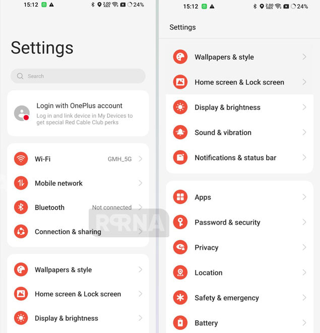
OnePlus OxygenOS 13 Settings: The build comes with a straightforward design that we have already seen in OxygenOS 12. The tech maker has divided the features within a particular box-like structure. For instance, the Connectivity section holds Wi-Fi, Mobile Network, Bluetooth, and Connection & Sharing as the main features. These elements also have sub-functions that you can get by tapping on the arrow.
Join Us On Telegram
Adding more, the background cards are straight and have rounded corners. On the flip side, the mini icons in the OxygenOS 13 Settings look quite good, colored in the same shade. However, you can change the color accordingly. The overall look is satisfying and convenient for the eyes.
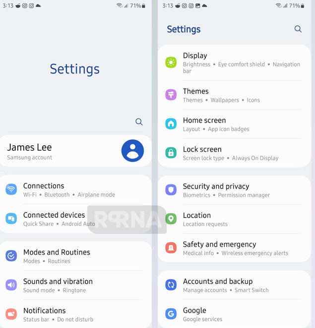
Samsung One UI 5.0 Settings: In comparison to OxygenOS 13, One UI 5.0 Settings User Interface holds better visibility. It frames and divides the features with a single line in-the-box framework. This makes the user understand the labels clearly. The menu option icons are a bit smaller than OxygenOS 13 and appear in a rounded square form. Meanwhile, the menu has a round corner background card to group certain categories.
If we go through the feature list, the One UI 5.0 Settings menu opens a detailed catalog, describing each feature separately. For example, the connectivity menu in Settings has two options: Connections which defines the mobile network, and Connected Devices which defines the smart interconnectivity experience.
To conclude, there aren’t such differences that can announce the winner of this comparison. But the neat, tidy, and interactive look of the One UI 5.0 Settings User Interface say that OnePlus needs to work a little more in this aspect.