OxygenOS 14 is running on the beta treadmill and in the meantime, some OnePlus fans are sharing their inputs regarding the newest software testing experience. Speaking of which, a user highlighted the new camera layout changes in OxygenOS 14 beta, which may not impress you to much extent.
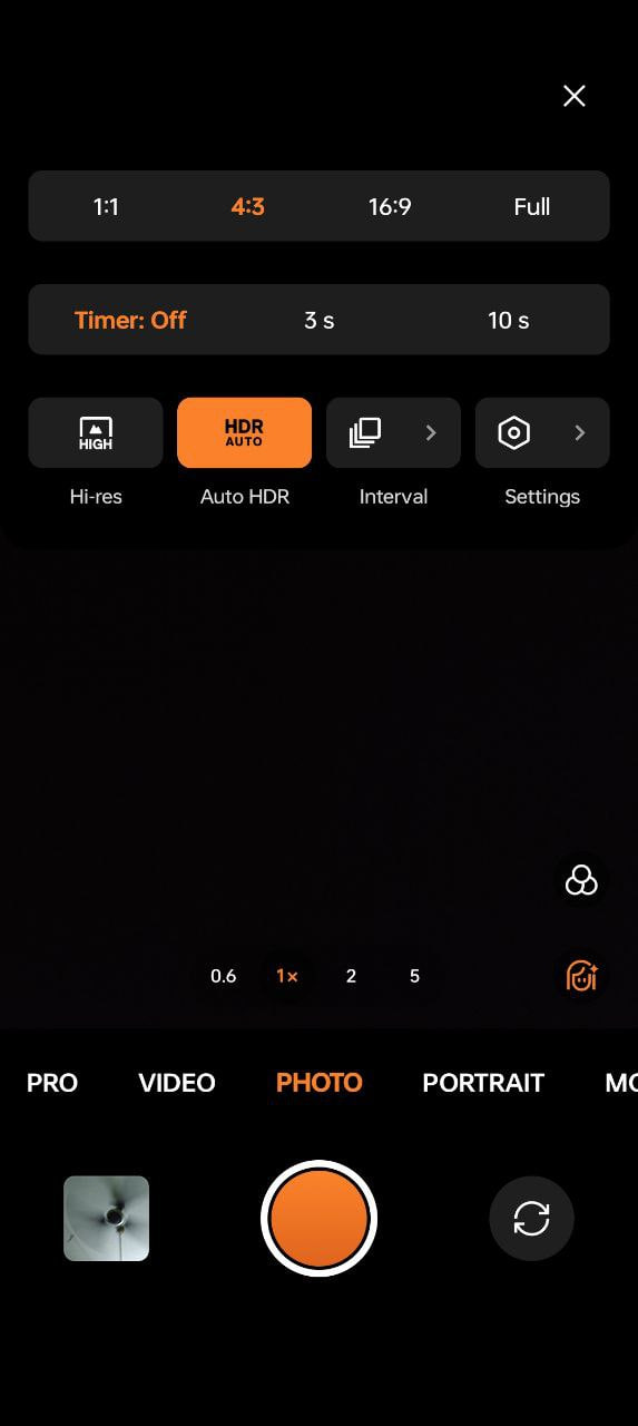
Eventually, a tech blogger on X (Twitter) witnessed a few camera changes in OnePlus 11 after installing the latest OxygenOS 14 beta. Ahead, the user dropped a screenshot of the new layout asking users whether they favor this new design or would like to rely on the same tweaks.
Before proceeding with audience polls, let’s talk about the design.
The font at the bottom section reflecting camera modes is quite bold and dark. Consequently, the company has polished the small icons to enhance the visual appearance. Besides, the overflow menu in the camera app now shows up in two distinct gray-colored lines reflecting ratios, and Timer options.
Meanwhile, the third section in the same menu holds four tabs showing features like Hi-res, Auto HDR, Interval, and Settings. These new additions seem to be clear to the eyes. You can check the screenshot below.
While many users said that the overall outlook is quite fresh and offers a new feel to the eyes, a few of them said that the fonts are quite bold and make the appearance ugly. As per users, the previous layout used to be much more one-hand-friendly.
Of course, the latest outlook is more organized but sacrifices the minimal look and one-hand ease. What are your thoughts on this matter? Which layout would you prefer? Let us know in the comment section.
Follow our socials → Google News, Telegram